

React tiny tooltip - a react library to create beautiful tooltips
A brief overview of why and how I created a react library to simplify building tooltips


You can also read the article here: lalit.codes/blog/react-tiny-tooltip
I built a small and lightweight react library for my projects some time ago for creating beautiful and accessible tooltips in react - React Tiny Tooltip. I'm happy to open-source it now!

This short blog goes through briefly about this package.
Using the library
import React from "react";
import { Tooltip } from "react-tiny-tooltip";

export default () => (
  <div>
    <Tooltip content="Hello there" side="top">
      <button>Hover here!</button>
    </Tooltip>
  </div>
);
Here's how it would look

Handy links
GitHub Repo • Documentation website
Inspiration
I built a tooltip when I was building a project - Paperclip. I liked the tooltips that I built in Paperclip and wanted to reuse them in all my other projects, so I went ahead and created react-tiny-tooltip. I've used it in all my projects since then. But this repo was closed source for a long time. So I just found some free time this weekend to open-source this. Hope you like it ✌️
Libraries used
List of all libraries used in creating this package
tsup for bundling code
Hyperdocs for creating docs (another project by me ;))
Radix UI for the unstyled tooltip component
Stitches for styling the tooltip
np for managing releases
Typescript to provide type definitions for the package
I've purposefully limited the props that can be passed to the component to reduce the complexity.
The available props currently are arrow, delay, side and sideOffset.
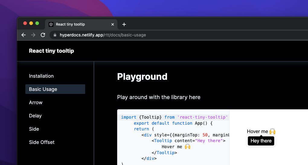
Building documentation
I used my own project Hyperdocs for creating docs for this project. I'm biased but I was able to complete the docs in no time. All I did was added a bunch of markdown files and linked them with Hyperdocs. This process was much simple than what I had to do for my other project StaticShield with Nextra.
With Hyperdocs I was able to add add code previews right inside the docs for each prop. This helps you play with the library while reading the docs alongside.
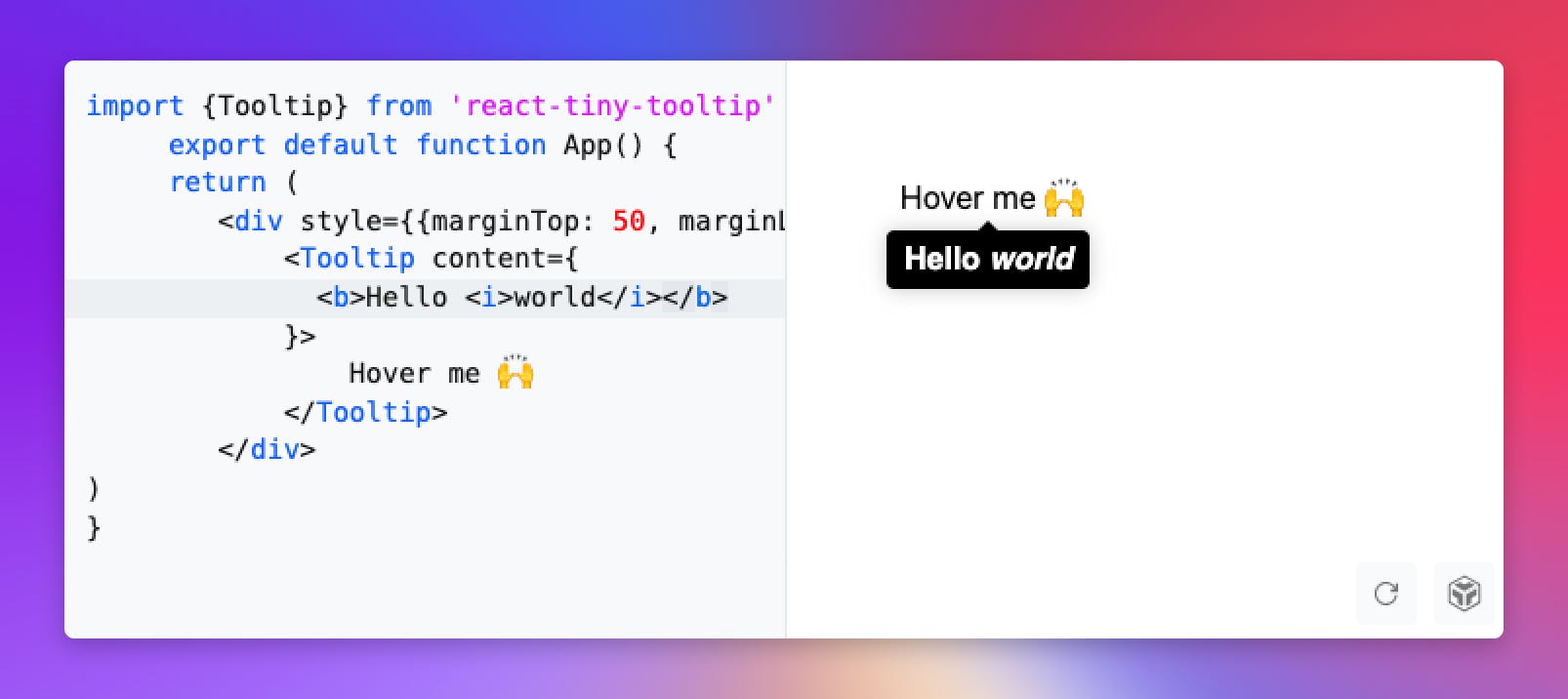
React components as tooltip content
This is one of the main reasons why I created this library. Most of the libraries only support rendering text in the tooltip. But react-tiny-tooltip can render any react fragment as tooltip content too!
Get started now by running
npm install react-tiny-tooltip
Thanks for reading this small article 😄
Let me know your suggestions below in the comments section.
You can also submit feedback from the docs.
Feel free to open PRs and issues on the repo